Insights
Effective Decision-Making with a Relevant Management Dashboard

Effective decision-making in the business world hinges on the understanding of data. Although information is readily available, comprehending and harnessing it can be a challenge. This is where a management dashboard comes in. In this blog, we extensively discuss the steps and best practices to develop such a dashboard. But before delving deeper into that, let’s first examine the definition and evolution of management dashboards.
What is a Management Dashboard?
Imagine you’re driving a car or piloting an airplane. On your dashboard, you find essential information such as speed, oil pressure, temperature, and more. At a glance, you know if everything is in order without losing your focus. Similarly, managers are increasingly relying on management dashboards to lead their organizations today.
The benefits are akin to those of a driver: managers gain access to crucial information, neatly displayed on one well-designed screen, enabling them to swiftly identify issues and take action to enhance their organizations’ performance.
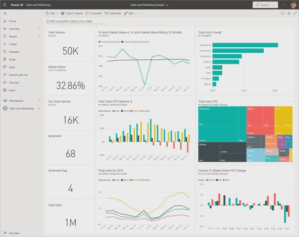
A management dashboard is an integrated information system that displays crucial data and performance indicators of an organization in a visually appealing and understandable manner. It enables managers to gain real-time insight into their organization’s performance and make data-driven decisions.
The Evolution of Management Dashboards

Until 1980: Static Reports
In the early days of management, information was primarily communicated through static reports and spreadsheets. These reports were often presented on paper and manually compiled. Managers had to rely on printed financial statements and charts to make decisions. These static reports were time-consuming to produce, and the information was often outdated by the time it reached decision-makers.
From 1980 to 2000: The Rise of Digital Dashboards
The 1980s and 1990s brought a new revolution with the emergence of Business Intelligence (BI) software. This introduced the very first digital dashboards, promising senior managers colorful graphical screens and user-friendly buttons to visualize business information. The major challenge during that time was the limited availability of data due to restricted databases and the lack of automated data integration.
From 2000 Onward: Interactive Dashboards
The early 2000s marked a groundbreaking period in the evolution of management dashboards. Improved data integration made it possible to seamlessly combine data from various sources in real-time. Modern Business Intelligence (BI) tools like Tableau, Qlik, and Power BI play a crucial role in this. These tools allow users to create customized dashboards with dynamic charts, simple filters, and the ability to dive deeper into the data.

A Step-by-step Guide for Setting Up an Effective Management Dashboard
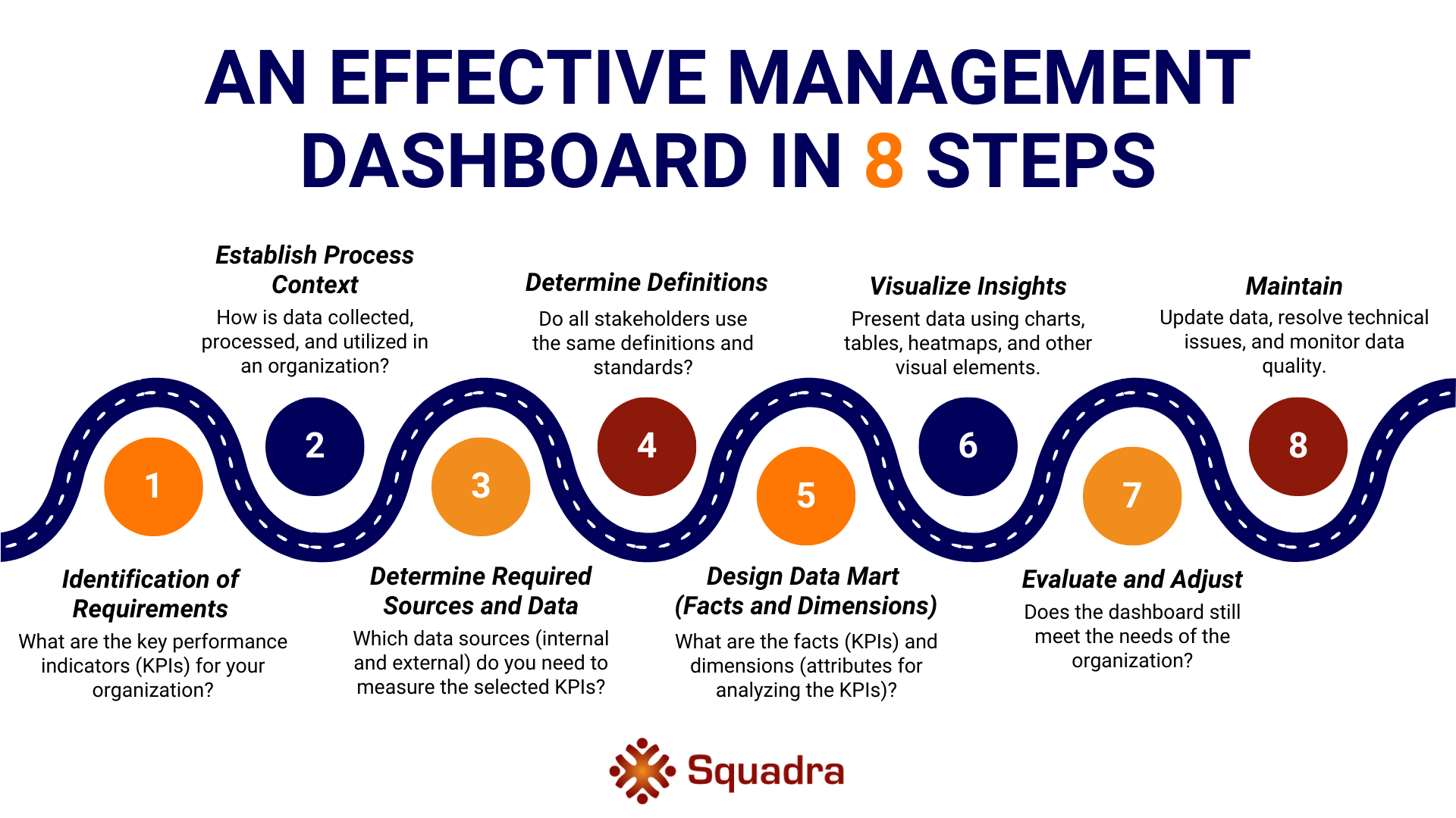
An effective and efficient dashboard provides relevant, accurate, and timely insights that lead to better-informed decisions and actions. This is an iterative process carried out in close collaboration with both business teams and developers. Management dashboards can elevate your organization to a higher level by offering clear insights into business performance and supporting decision-making. But how do you set up such a dashboard? The step-by-step guide by Mark Dumay, Partner at Squadra Analytics, offers a structured approach.

Setting Up a Management Dashboard: a Practical Example
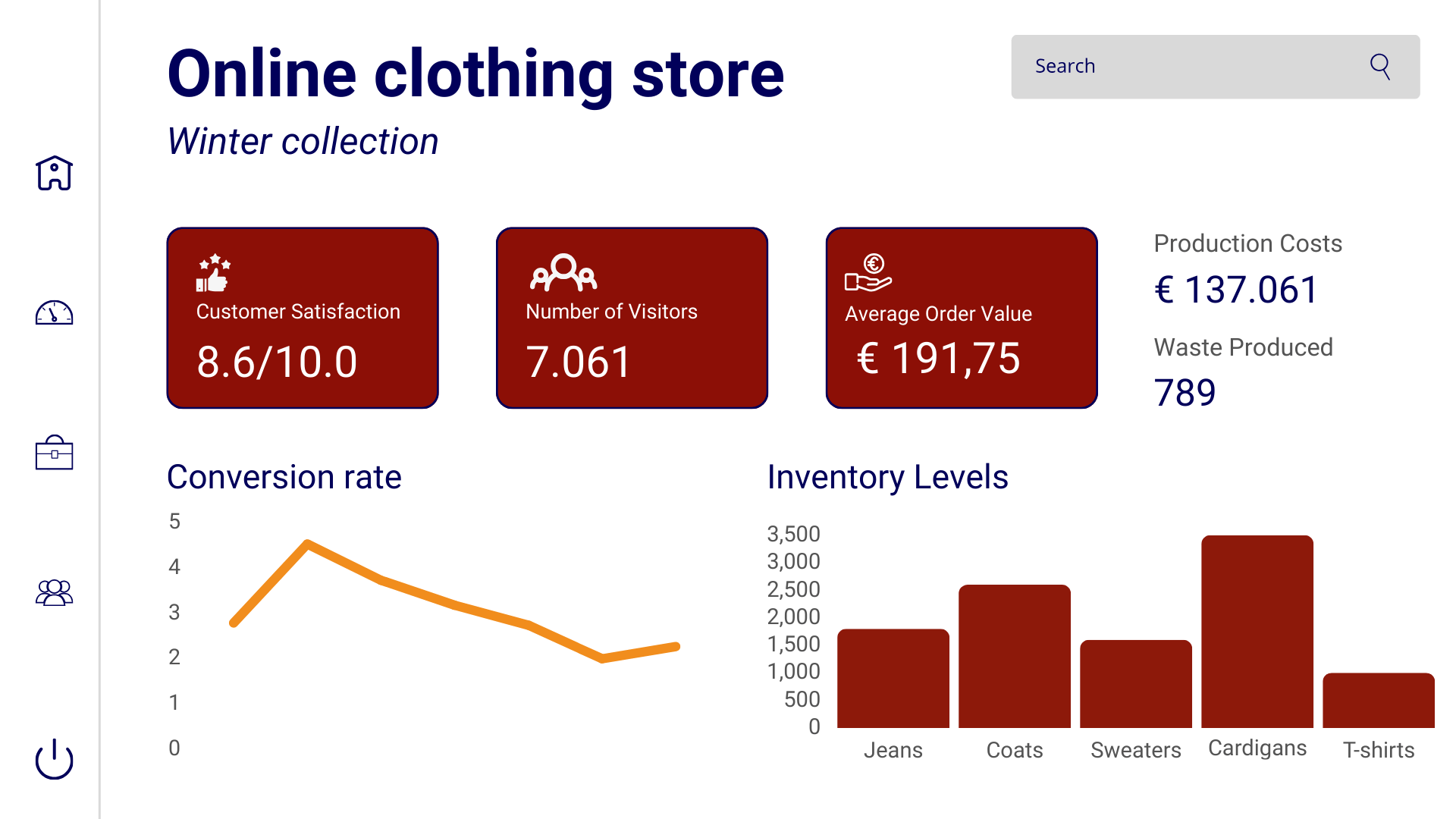
Let’s illustrate this process with a practical example. Imagine you manage a fast-growing online clothing store, and you want to set up a management dashboard to track the performance of your e-commerce business. You recently launched a new marketing campaign to promote your winter collection, but you’ve noticed that the conversion rate for this specific collection is lower than expected. You want to gain insight into what might be going wrong and how to improve it. Here’s how you can apply the steps in this context:

Best Practices for the Use and Implementation of a Management Dashboard
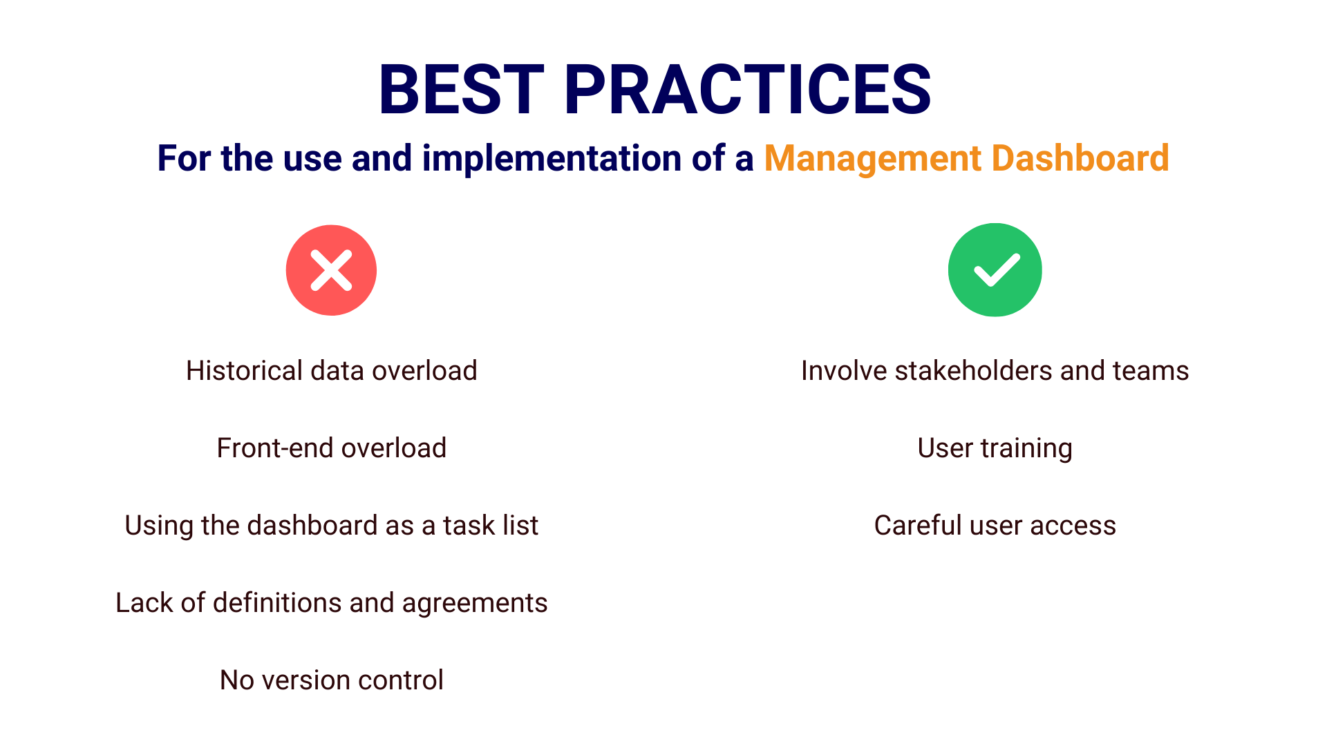
The implementation and effective use of management dashboards require attention to various best practices to ensure they achieve their intended goals and add value to the organization. Here are some key considerations.

1. Involving Stakeholders and Teams
A crucial first step is to ensure that all relevant stakeholders and teams are involved in the development and implementation of management dashboards. This includes managers, data analysts, IT teams, and the end users of the dashboards. Through this collaboration, the dashboards can be tailored to the needs and goals of the organization. A well-designed dashboard not only provides relevant insights but also encourages improvement and action in business operations.
2. Training and User Access
It is essential to ensure that users of management dashboards receive the necessary training and support. This includes training in the use of the tools used and understanding the provided data. Additionally, careful consideration should be given to who has access to which parts of the dashboards to ensure the confidentiality of sensitive information.
3. Avoid Pitfalls
To ensure that management dashboards remain effective, it’s important to avoid some common pitfalls:
- Historical Data Overload: Storing historical data in management dashboards is valuable for analyzing trends and patterns. However, be cautious of historical data overload. Too much historical data can slow down the dashboard and make it unnecessarily complex. Users may become frustrated with slow loading times. It’s essential to strike a balance between historical and current data to optimize performance.
- Front-end Overload: Complex calculations and data processing can put a strain on the front-end of your dashboard. This can lead to slow performance and user frustration. Consider moving these heavy tasks to a Data Warehouse (DWH) to improve performance and ensure faster loading times. This way, users can quickly access the information they need.
- Misuse as a To-do List: Management dashboards are designed for strategic decision support and not as daily to-do lists. It’s important to remind users that the intended purpose of these dashboards is to provide insights into overall business performance and support strategic decision-making. Using them as task lists for daily activities can disrupt the focus.
- Lack of Definitions and Agreements Clear definitions and agreements regarding the terms and indicators used in the dashboard are crucial. If different users interpret the same terms in different ways, it can lead to confusion and inconsistency in data interpretation. Ensuring a common understanding is essential for accurate decision-making.
- Lack of Version Control: Version control for dashboards is a must, especially when multiple users are involved in adjustments and updates. The absence of version control can lead to confusion and errors when updating dashboards. If there are no previous versions to fall back on in case of mistakes, it can jeopardize the reliability of data and decision-making. Implement version control to be able to refer to previous versions when needed.
In summary, avoiding these pitfalls is essential to ensure that management dashboards are effective and usable for strategic decision-making and business analysis. By paying attention to these pitfalls and taking proactive steps to avoid them, you can ensure the successful deployment of your management dashboard and improve decision-making within your organization.
Conclusion
Management dashboards are the backbone of data-driven decision-making and are crucial for navigating to success in modern organizations. After exploring the definition and evolution of management dashboards and highlighting the essential elements, it is now up to you to apply these insights and best practices in your own organization.
The starting point for an effective dashboard lies in following a structured approach, from identifying requirements to regular maintenance. In addition, best practices are invaluable in both the use and implementation of management dashboards. By involving stakeholders, ensuring training and access, and avoiding pitfalls, you can significantly increase the chances of success.
In short, management dashboards are not only valuable but also necessary for modern businesses. It may require time and effort, but the results are absolutely worth it. Get started now, apply these principles, and lead your organization toward a data-driven future full of success.

